
Flamingo Fruit Company
Project description
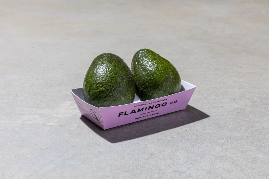
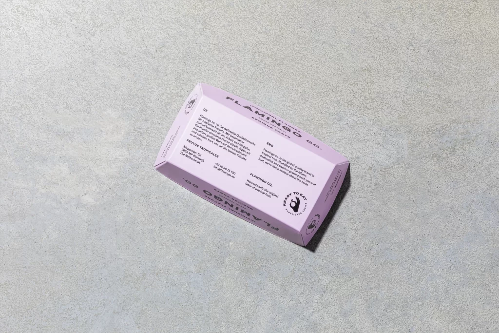
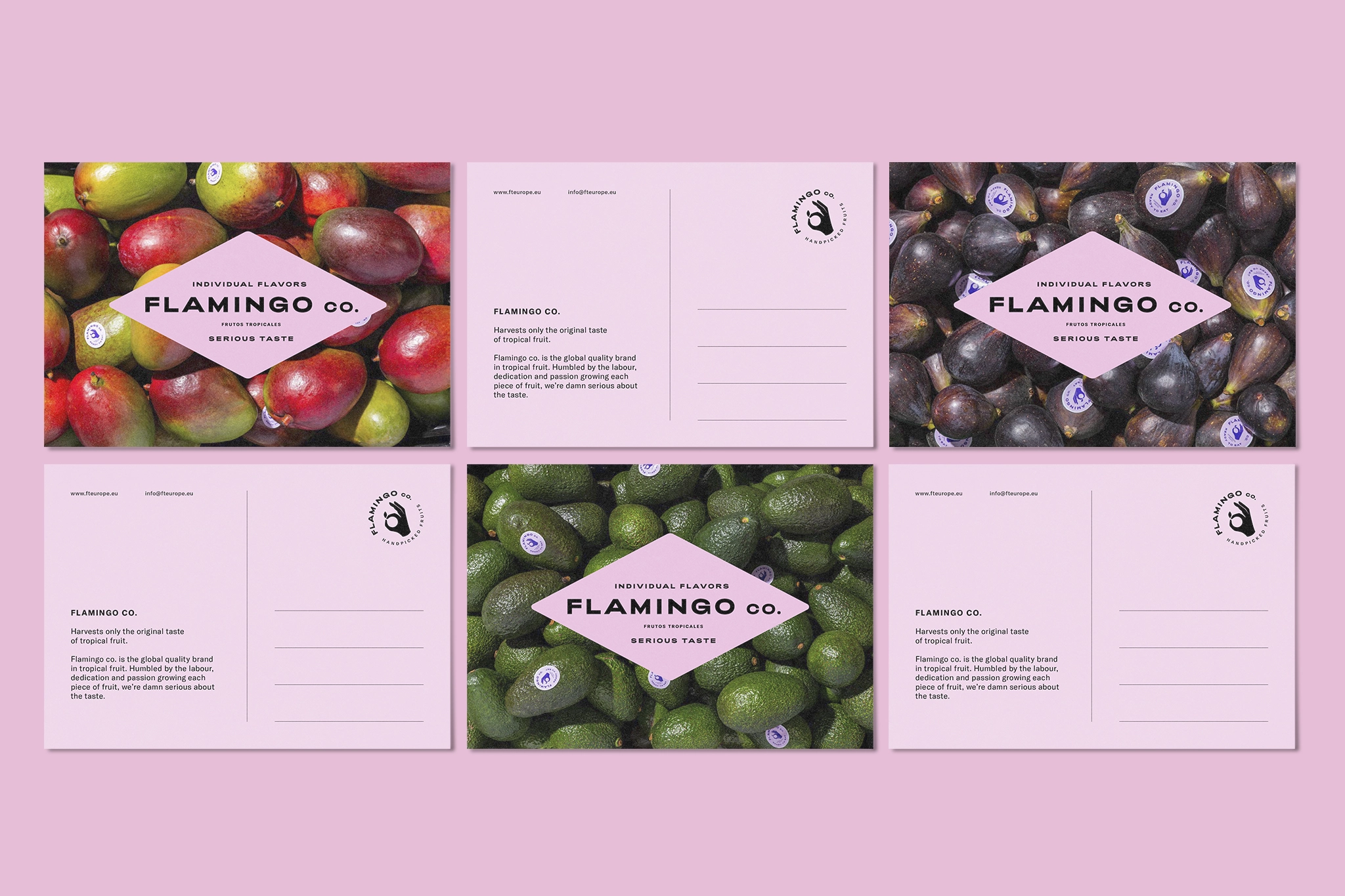
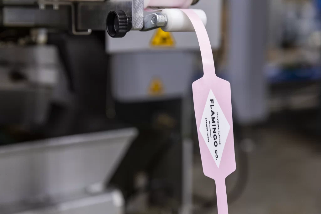
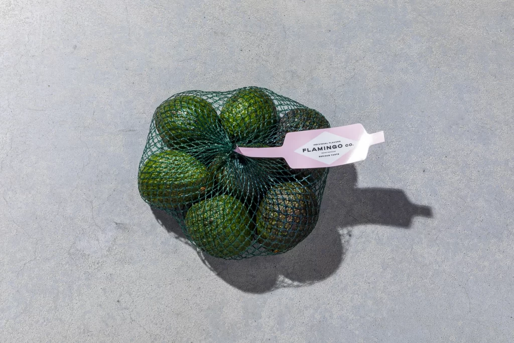
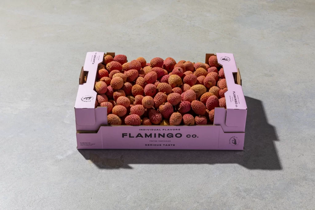
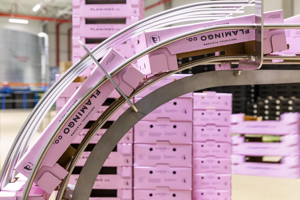
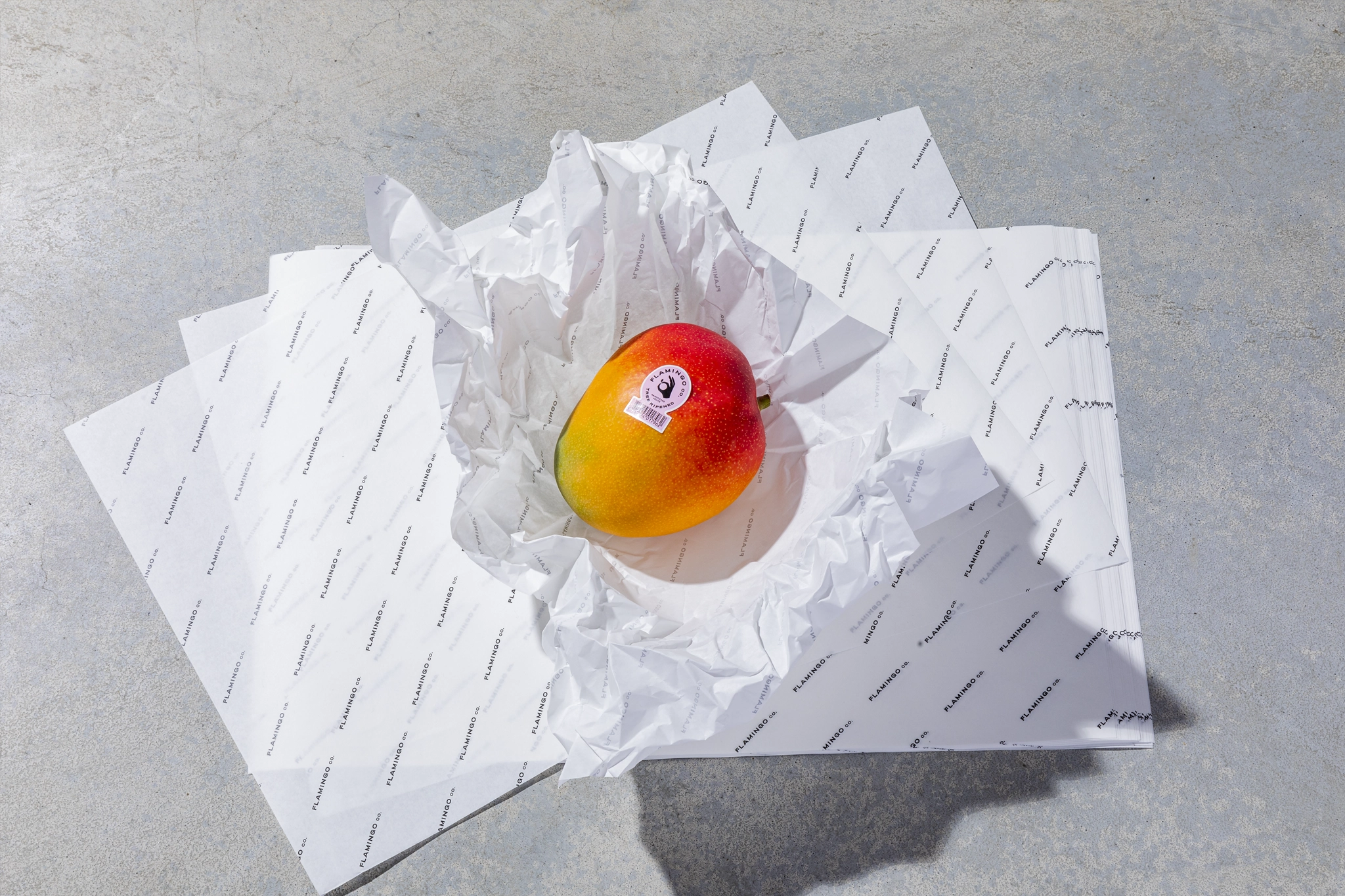
As a graphic designer at Containr Affairs, I designed the complete rebranding of Flamingo Fruit Company—a house brand of FTE Europe specializing in premium tropical fruits sourced from Latin America, Asia, and Africa. My responsibilities included designing the logo, fruit stickers, fruit nets, cardboard boxes, ripeness guides, packaging, and web elements, while also handling art direction for the photoshoot in collaboration with photographer Mees van den Eckart. Flamingo offers a curated selection of exotic produce like premium mangoes, avocados, figs, limes, ginger, pomegranates, and physalis.
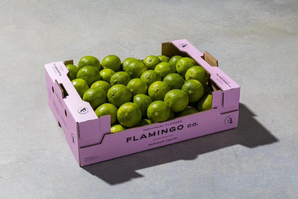
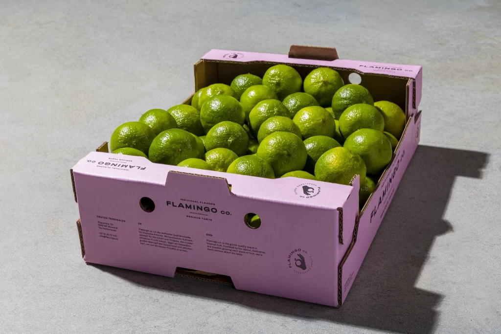
The goal of the rebranding was to create a modern, fun, and differentiated global identity. Unlike competitors who overload packaging with clichéd tropical imagery and excess information, my goal was to build a fresh, fun, and contemporary global fruit brand that stands out. Given the commonality of the name "Flamingo," I ditched the outdated flamingo bird trademark, opting instead for its iconic pink color and adding "Company" to highlight international trading roots. This rebranding elevates Flamingo as a premium, approachable tropical fruit company.
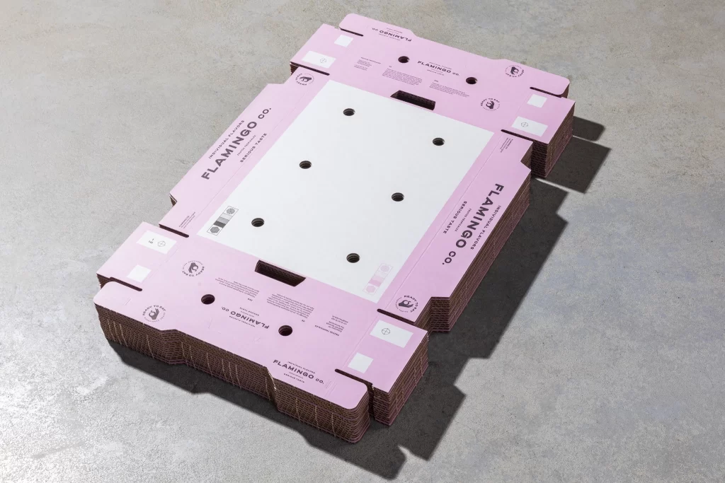
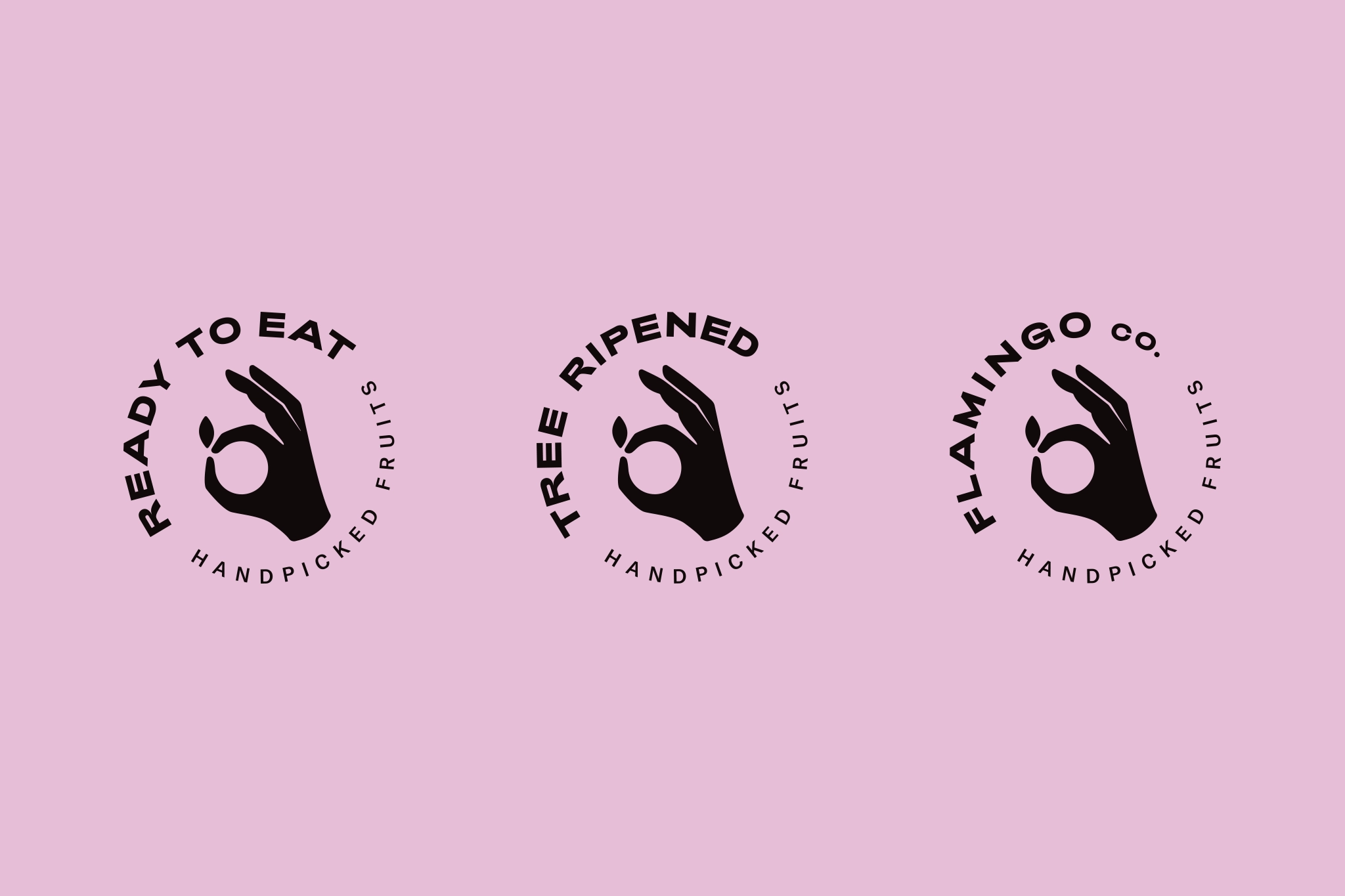
To contrast the soft pink palette, I selected a bold, characteristic font for headings paired with a clean sans-serif typeface for body text, incorporating diamond shapes to nod to vintage fruit companies while delivering a modern twist. The design emphasizes the ripeness, juiciness, and field-fresh quality of each fruit, honoring the labor and dedication involved. Central to this is the new hand symbol—depicting a hand with negative space forming a fruit shape—serving as the trademark, quality seal, and versatile stickers. The symbol remains consistent, but surrounding text varies for "ready to eat" and "tree-ripened" labels, reinforcing authenticity and superior taste.
The goal of the rebranding was to create a modern, fun, and differentiated global identity. Unlike competitors who overload packaging with clichéd tropical imagery and excess information, my goal was to build a fresh, fun, and contemporary global fruit brand that stands out. Given the commonality of the name "Flamingo," I ditched the outdated flamingo bird trademark, opting instead for its iconic pink color and adding "Company" to highlight international trading roots. This rebranding elevates Flamingo as a premium, approachable tropical fruit company.
To contrast the soft pink palette, I selected a bold, characteristic font for headings paired with a clean sans-serif typeface for body text, incorporating diamond shapes to nod to vintage fruit companies while delivering a modern twist. The design emphasizes the ripeness, juiciness, and field-fresh quality of each fruit, honoring the labor and dedication involved. Central to this is the new hand symbol—depicting a hand with negative space forming a fruit shape—serving as the trademark, quality seal, and versatile stickers. The symbol remains consistent, but surrounding text varies for "ready to eat" and "tree-ripened" labels, reinforcing authenticity and superior taste.
Agency
Containr Affairs
Photography
Mees van den Eckart
Services
Art Direction
Brand Development
Graphic Design
Logo Design
Brand Development
Graphic Design
Logo Design

Ready to shape your brand? Let's connect.